Graph of the week: In defence of defence cuts
If, as the saying has it, the exchange rate between words and pictures really is 1000 to 1, that’s too good a deal to pass up. Each week The Strategist will bring you some graphs that tell a story of their own. The first one:
In defence of defence cuts
Given the outcry at the news that this year’s defence budget was the lowest proportion of GDP since 1938, you’d be forgiven for thinking that Australia was wide open to military exploitation.
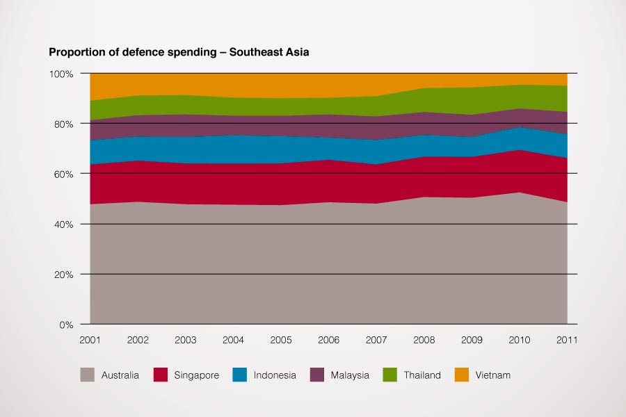
In the interest of perspective, here’s a graph (click to enlarge) that shows Australia’s spending on defence compared to the five biggest spending ASEAN countries (Source: DIO Defence economic trends in the Asia-Pacific 2011). Australia is spending nearly as much as the five put together—and has been doing so for over a decade. That buys a lot of extra military capability.
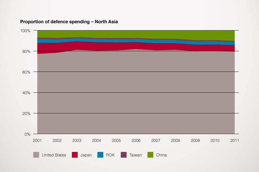
To head off the objection that the real ‘future adversary’ is somewhat further north than the ASEAN five, here’s the same graph (click to enlarge) for defence spending of the major players in North Asian security (Source: DIO Defence economic trends in the Asia-Pacific 2011). If the ANZUS Treaty is all it’s cracked up to be, there’s not too much to worry about.
Of course, the 2013 Defence White Paper has to worry about the future, not the past, and the trends there are not quite so reassuring from a western military muscle point of view. And, as Mark Thomson and I argued previously, local challenges to established powers become credible long before global ones. But it’s taking a long bow to suggest that a one year downturn in Australian defence spending is a national security catastrophe.
Andrew Davies is senior analyst for defence capability at ASPI and executive editor of The Strategist.


